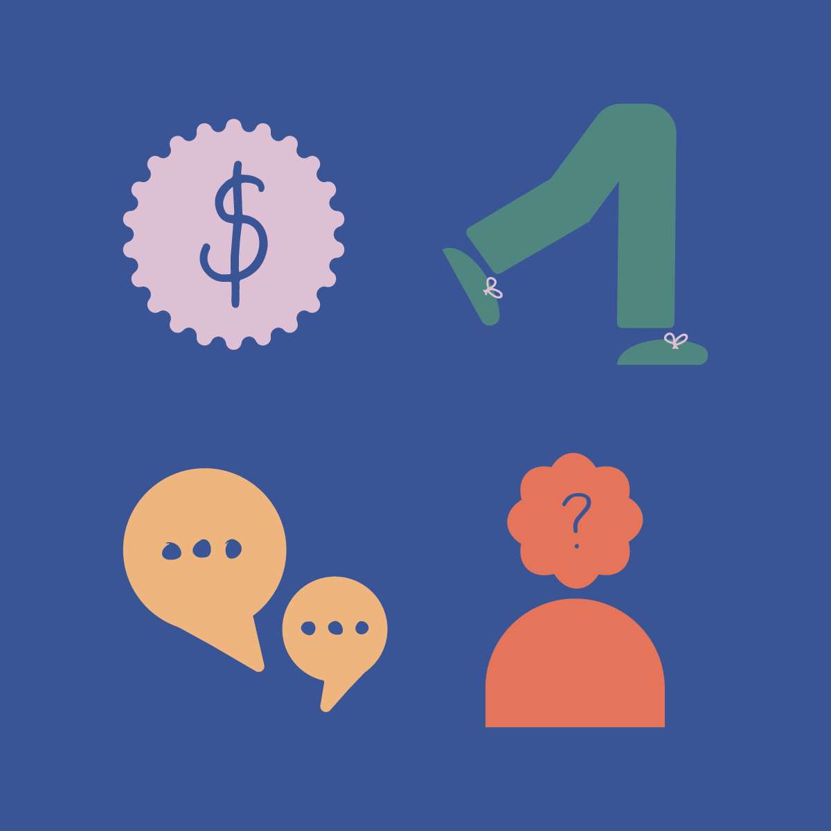
One of my favourite projects has been designing an identity for our Wellbeing campaign at Benoy. This project really resonated with me, as I am passionate about raising awareness of the importance of our mental health and advocating the support that we have available.
The brief was to refresh the branding for the Wellbeing offering for all staff across Benoy globally, which needed a logo, icons, thumbnails, calendar, and email template designed. From the start I knew the branding needed to be welcoming and warm so that people would feel the site was approachable when looking for help and resources.
We considered revising the name ‘Wellbeing’, changing it to something that felt less corporate and more inclusive and supportive, but new. However, after lots of research and conversations within the studio, we realised nothing else could encapsulate the breadth of what our mental wellbeing is. Instead, I used the branding to lift and excite the name.
I worked on creating several different concept routes that were fun but accessible, landing on a hand drawn and doodle route. This was developed to also include fun, bold shapes with a bright and friendly colour palette. These shapes were then designed to interact with words, replacing specific letters, with the hand drawn elements being used to highlight key words.


